
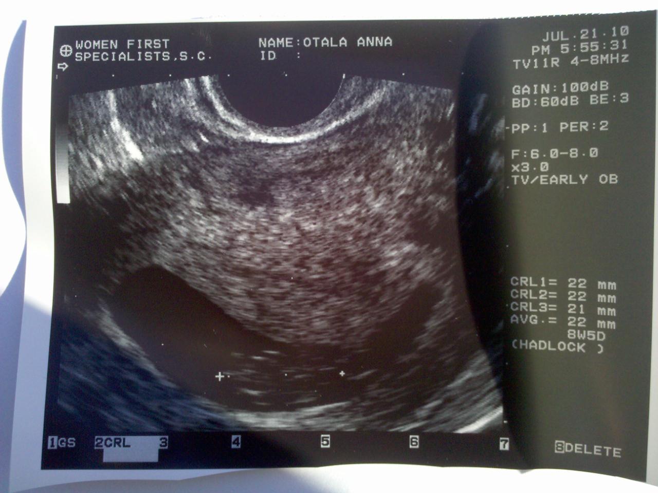
We just had our first appointment :) We saw the heartbeat beating about 170 beats per minute! Couldn't hear anything yet... I was floored...


First of all and if you have never seen Adobe Flash, do not try to convince yourself that you can manage it. Yes, you can probably learn some simple things from YouTube tutorials, but the flash templates of the new generation are much more than just a number or links, images and text blocks. So what’s the solution if you are a flash fan and dream of an awesome interactive flash template?
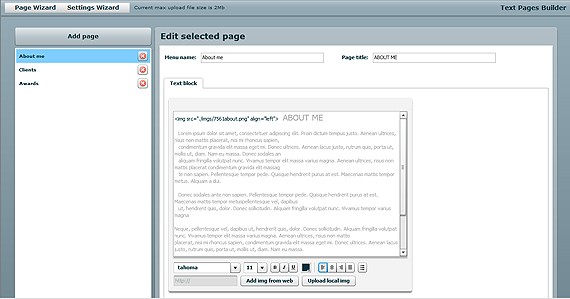
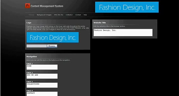
What’s a flash content management system or simply flash CMS? That’s a system that helps you manage your flash website without actual source files editing. The CMS based flash template usually consists of the 3 main sections: the design skin- that works like the shell for the content, the core- the codes and programmed functions, and the website content- that can be stored in the database or external txt/xml files. The content management system in simple words is an administrative interface where you can enter the content in a convenient, intuitive, friendly manner without going into any codes and this content will show up on the website in the real time.
So Flash CMS seems to be a really cool solution but can you build your website using its functionality if you are not a flash developer? The answer is obviously no. There have been lots of Flash CMS solutions reviews recently but they are useless for the regular users as most of us simply don’t know where and how to implement them. That’s why I have decided to create a review of Flash CMS templates solutions presently available on the market, the solutions that will allow you build your new flash website quickly, easily at without additional costs.
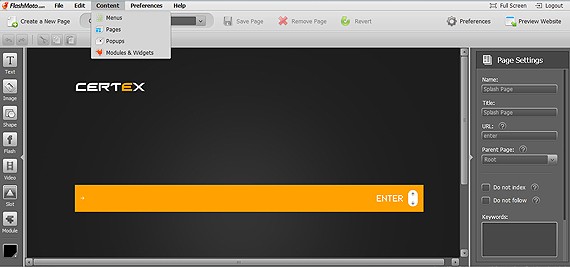
FlashMint is a leading provider of Flash CMS Templates. They have CMS v1, CMS v2 and CMS v3 templates presented in their collection. While the first two versions of FlashMint content management system where pretty primitive, version 3 looks cool. There’s a nice intuitive admin area and the administration interface allows to perform the following basic actions:
As every content management system FlashMint CMS v3 allows:
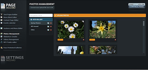
FlashMint CMS v3 was developed mainly as the content management system for portfolios and photography websites hence the following features:
Other modules presented in FlashMint CMS v3 include news editor, events editor, mp3 track editor, meta tags section. There are 30 beautiful flash templates to choose from, no special server requirements and no complicated installation. The system is not skin based, so every template is developed separately.
Template price: $204-215
Initially developed for photographers community, ReadyPhotoSite CMS can be used to create any type of website, from business to entertainment sites. The product is available in 4 packages:
The modules presented in ReadyPhotoSite CMS include:
The pricing for ReadyPhotoSite websites depends on functionality. The basic package is $149, creative $159, ecommerce- $199 and premium package is $250.
The collection presently includes 10 templates and several new templates are added monthly. The templates do not require database to store info. All the texts, paths to the files and parameters are stored in the external XML files used by the system. The system is skin based but there are certain design restrictions applied for every template and thus changing one design to the other might be not a good idea. Deep linking technology makes ReadyPhotoSite websites search engine friendly and lets your reference the difference sections of your flash website as if it was simple clean HTML.
View ReadyPhotoSite templates View admin area demo
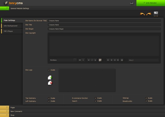
Fancy CMS is a new promising flash content management system that seems to be still in development. They have triumphantly launched their first template and promise more to come shortly. As a fresh developing product Fancy CMS might also be interesting for flash developers as there’s a beta version of Fancy Flash CMS Core available for free. One oops- the admin area is not available yet so if you decide to download the templates be ready to edit the info directly in the xml files.
Among the interesting features of Fancy Flash CMS are:
The system is skin based so you can easily change skins to newer design versions. At the moment the system is free.
Loved by flash developers the FlashMoto CMS has the widest range of functionality possible. There’s an option to edit the core of the system, add new modules and widgets and create separate projects based on the FlashMoto CMS. However when it comes to website management it gets complicated for most of us… since there are too many options available. Certain functionality limitations would guarantee that design look and feel remains stylish and professional but this in not the case when you can play around with almost every element and then can’t set it back to default position. Yet, we have to admit that FlashMoto CMS is a powerful engine, though (and in the consent of our theme today) oriented more on developers than end users. What’s really cool about this CMS is the Multilingual Control Panel supporting 12 languages.
Among the features of the FlashMoto CMS you will find:
While the admin area works smooth I can’t call it intuitive though this can be a matter of time and getting used to things. People logging in for the first time to WordPress or Oscommerce admin area might be feeling kinda lost as well :)
The templates cost around $250 and are all designed in the up-to-date clean style which makes the offer even more attractive.
There’s an interesting fact that FlashMint and FlashMoto which are supposed to be competitors have recently signed an agreement where FlashMint will be developing templates based on FlashMoto CMS.
View FlashMoto CMS templates View admin area demo
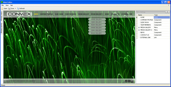
Mint editor is another flash website management product created by www.flashmint.com. This is not a standalone product or system but rather a management interface allowing to easily update info on the flash templates via simple admin area. While opened in Mint Editor, the template is represented as a structured combination of various flash components, with a separate set of configuration settings for each of them. The list of components include:
Mint Editor is probably the cheapest solution of that kind presented on the market. Mint Editor templates cost $50 and are hand-coded for a certain appropriate design.
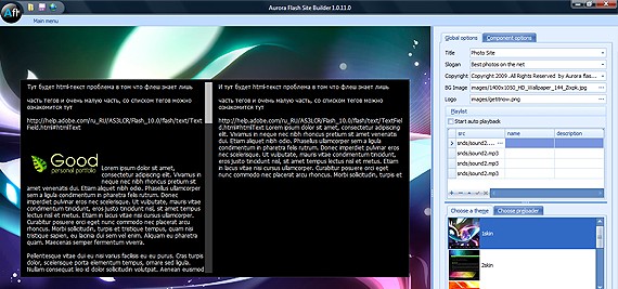
In simple words AuroraFlash site builder is your desktop flash WYSIWYG editor allowing to build fantastic flash websites without any special skills and within 30 minutes. The concept is very simple and the editor works as a candy. All you have to do is download the editor and auto install it on your computer in several simple clicks. After that the program will offer you choose the template to work with from the number of default designs and the interface will load.
The components presented in default free templates include:
There’s a set of flash templates you can download directly from the website absolutely for free and use it for creating of your personal website, however if you plan creating a project for your customer based on AuroraFlash website builder be sure to read the licensing terms.
Developer:
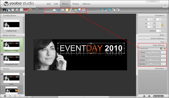
Yooba Flash CMS is a tool for creating simple flash animated websites in the Yooba environment. That’s a hosted solution so in order to manage your website you have to login to the membership area on the Yooba website. Before starting on the project you’ll have to prepare the design of your new web page and save all the elements as separate images that then will be uploaded to your Yooba interface. The nice feature about Yooba is that they offer simple website visitors stats.
The price of Yooba is somewhat high- €40 per slot a month and you have to build the design on your own. Yooba is not a CMS in the usual understanding however it allows to create animated websites with easy and without flash or any other special knowledge.
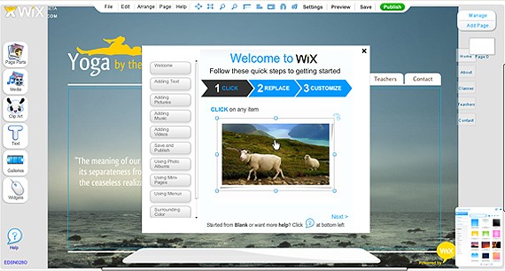
If you have ever been looking for a free flash website you might have been on a Wix site and even considered using their builder to create your free flash website. Guys at Wix have a huge number of nicely designed templates and working with the Wix system is a real pleasure. It takes just a few minutes to sign up with them, choose the template and proceed to the editing interface. Editing the template reminds more of a fun game with big iconed tools :) You can change texts and fonts, you can add photos, videos and music and create nice galleries. You can also view your website online on the link like this one http://www.wix.com/adzyasan/anastasia and it’s also for free.
If you want more features than the free version of Wix allows you can sign up for a premium account (starting from $4.95/month) and use your own domain name, remove Wix ads and logo from your website.
Developer:
According to TemplateAction team, TemplateAction website templates are fully customizable and editable via an extensive control panel. The admin area allows:
Compared to other Flash CMS system reviewed above, TemplateAction CMS doesn’t have an advanced functionality but it’s quite enough for a simple flash business or personal website. There are 17 nice templates presently available and the price is fair- $89 only. There’s a admin panel demo available on YouTube so you have a good chance to review the functionality before making your choice of the CMS based flash template and placing the order.
In conclusion I’d like to say that it’s only up to you what system to choose for creating and managing your flash website but let me give you some advice.
You and I were designed to be friends with God, to be close to Him, to know Him and be known by Him. God gave mankind freedom to walk away, and man did. So now there is a separation. We are separated from the Deity we were supposed to be in relationship with. Without that love, we trade on each others love, which pales in comparison. When my friend saw that I called him by another name, he was reminded of the relationship he was supposed to be in, and reminded how impotent human love can be. He forgave me, but it’s a sad reminder. It’s even sadder because my friend is one of the most loving, other-person centered people I know, and as an introvert, I’m terrible in comparison.
But the news isn’t all sad. Through Christ, we will be reunited with God at the wedding feast of the lamb. We will be reunited with God, because God will look at us and see his Son, and we will have that relationship again. Until then, we are called to love, to work on love, to practice love, because love is what calms people down, comforts them and helps them believe something better may exist. Some day we are going to get the love we were designed to receive. And that thought gives me hope.
| |||
|
YOU KNOW YOU'RE GONNA PASS THIS ALONG. . . . . . . .
PAY ATTENTION! LISTEN AND READ CAREFULLY.
A palindrome reads the same backwards as forward. This video reads the exact opposite backwards as forward. Not only does it read the opposite, the meaning is the exact opposite.
This is only a 1 minute, 44 second video and it is brilliant. Make sure you read as well as listen...forward and backward.
This is a video that was submitted in a contest by a 20-year old. The contest was titled "u @ 50" by AARP. This video won second place. When they showed it, everyone in the room was awe-struck and broke into spontaneous applause. So simple and yet so brilliant.
Take a minute and watch it. This video is best watched by clicking on the link to see it full screen. Or you can watch it below.

| By Steve Vickers BBC News, Harare |
In many ways, the Lemba tribe of Zimbabwe and South Africa are just like their neighbours.
But in other ways their customs are remarkably similar to Jewish ones.
They do not eat pork, they practise male circumcision, they ritually slaughter their animals, some of their men wear skull caps and they put the Star of David on their gravestones.
Their oral traditions claim that their ancestors were Jews who fled the Holy Land about 2,500 years ago.
It may sound like another myth of a lost tribe of Israel, but British scientists have carried out DNA tests which confirm their Semitic origin.
These tests back up the group's belief that a group of perhaps seven men married African women and settled on the continent. The Lemba, who number perhaps 80,000, live in central Zimbabwe and the north of South Africa.
 Lemba women do not have Jewish DNA |
And they also have a prized religious artefact that they say connects them to their Jewish ancestry - a replica of the Biblical Ark of the Covenant known as the ngoma lungundu, meaning "the drum that thunders".
The object went on display recently at a Harare museum to much fanfare, and instilled pride in many of the Lemba.
"For me it's the starting point," says religious singer Fungisai Zvakavapano-Mashavave.
"Very few people knew about us and this is the time to come out. I'm very proud to realise that we have a rich culture and I'm proud to be a Lemba.
"We have been a very secretive people, because we believe we are a special people."
Religion vs culture
The Lemba have many customs and regulations that tally with Jewish tradition.
They wear skull caps, practise circumcision, which is not a tradition for most Zimbabweans, avoid eating pork and food with animal blood, and have 12 tribes.
 Tudor Parfitt University of London |
They slaughter animals in the same way as Jewish people, and they put the Jewish Star of David on their tombstones.
Members of the priestly clan of the Lemba, known as the Buba, were even discovered to have a genetic element also found among the Jewish priestly line.
"This was amazing," said Prof Tudor Parfitt, from the University of London.
"It looks as if the Jewish priesthood continued in the West by people called Cohen, and in same way it was continued by the priestly clan of the Lemba.
"They have a common ancestor who geneticists say lived about 3,000 years ago somewhere in north Arabia, which is the time of Moses and Aaron when the Jewish priesthood started."
Prof Parfitt is a world-renowned expert, having spent 20 years researching the Lemba, and living with them for six months.
The Lemba have a sacred prayer language which is a mixture of Hebrew and Arabic, pointing to their roots in Israel and Yemen.
Despite their ties to Judaism, many of the Lemba in Zimbabwe are Christians, while some are Muslims.
"Christianity is my religion, and Judaism is my culture," explains Perez Hamandishe, a pastor and member of parliament from the Movement for Democratic Change (MDC).
Despite their centuries-old traditions, some younger Lemba are taking a more liberal view.
"In the old days you didn't marry a non-Lemba, but these days we interact with others," says Alex Makotore, son of the late Chief Mposi from the Lemba "headquarters" in Mberengwa.
"I feel special in my heart but not in front of others such that I'm separated from them. Culture is dynamic."
Crowds
The oral traditions of the Lemba say that the ngoma lungundu is the Biblical wooden Ark made by Moses, and that centuries ago a small group of men began a long journey carrying it from Yemen to southern Africa.
| David Maramwidze Lemba elder |
The object went missing during the 1970s and was eventually rediscovered in Harare in 2007 by Prof Parfitt.
"Many people say that the story is far-fetched, but the oral traditions of the Lemba have been backed up by science," he says.
Carbon dating shows the ngoma to be nearly 700 years old - pretty ancient, if not as old as Bible stories would suggest.
But Prof Parfitt says this is because the ngoma was used in battles, and would explode and be rebuilt.
The ngoma now on display was a replica, he says, possibly built from the remains of the original.
"So it's the closest descendant of the Ark that we know of," Prof Parfitt says.
Large crowds came to see the unveiling of the ngoma and to attend lectures on the identity of the Lemba.
For David Maramwidze, an elder in his village, the discovery of the ngoma has been a defining moment.
"Hearing from those professors in Harare and seeing the ngoma makes it clear that we are a great people and I'm very proud," he says.
"I heard about it all my life and it was hard for me to believe, because I had no idea of what it really is.
"I'm still seeing the picture of the ngoma in my mind and it will never come out from my brain. Now we want it to be given back to the Lemba people."
So you fancy yourself a Paul Rand or Saul Bass and want to design some logos for iStock? Great! You've come to the right place! Logo design needs to begin with a great idea or concept, backed up with some jedi-like vector skills to bring it to life. In this article you'll find some design and technical tips to get you started and keep you on the right track. I've included some important things for you to think about as you are creating, as well as some reminders on how to keep your files technically sound for submission to avoid the dreaded "Subpar" rejection.
Thought and planning are a huge part of Logo design: preparation is key. We've prepared a set of considerations here for any illustrators ready to plunge into Logos. Keep the following in mind during your planning and throughout the process.
Please note: The 'good' versions of logo design seen below were each designed by some of our amazing logo contributors. They'd never dream of submitting anything like the 'bad' files you see here, which we created for illustrative purposes only!
Start by selecting a Business Category or something that inspires you. Try to envision who the client will be or what kind of company or business may want to buy your logo. Creativity sometimes strikes when you combine a couple of ideas. For example, you may decide on creating a logo for a security company. For this business category you probably would want to convey trust, strength and reliability. This can be accomplished by choosing appropriate subject matter and using style, colors, weight, balance and shapes. The idea could be a bear with strong angular or masculine shapes and bold, dark colors combined with a sturdy font to finish it off.
By clearly visualizing who your client is and with some forethought, research and planning, the end result should be an appropriate symbol that immediately identifies the company, and clearly communicates the product or service. This is absolutely key to a successful logo design and should always be foremost in your mind while conceptualizing your design.
When you have your concept, start sketching it out to quickly come up with ways you can execute the idea. Starting in black and white can help ensure that your design is clear, legible and reproducible without any distracting features. Adding great color, style characteristics, or subtle effects will help make your design unique to stand out amongst the competition. Add some type to bring some context to your design and choose a font that compliments the symbol and communicates clearly. To ensure a successful logo remember to keep your design, Simple, Memorable, Timeless, Versatile, and Appropriate.
Read more on how to sketch out your ideas here
It's extremely important that Logos are created with versatility in mind. As the main component of a company's corporate identity, the logo acts as the cornerstone of their visual brand. This means it must be reproducible using a huge variety of formats and processes while maintaining the integrity of the logo as it is utilized. Logos may be printed on anything like small business cards and pens to extremely large billboards and signage. They need to work well using traditional print methods like offset lithography and screen printing for T-Shirts, as well as other things the buyer may want like rubber stamps, stickers and embroidered golf shirts. Of course, it must also look fabulous on screen for use on websites and other pixel based media. It's a good idea to test your logo file at a monitor resolution of 72ppi at an inch or so wide to see what issues may pop up.
Here are some things to watch out for to keep your design from ending up on top of the reject pile:
— Consider carefully how much detail to add to your logo design. Lots of small shapes and skinny lines should be avoided as they could disappear or print very broken and rough when reduced to small sizes.
— The white spaces, or negative spaces, between shapes should be consistent and not too close together or they may fill in causing a loss in the definition of objects.
— Gradients should be used selectively, creatively, and only when they enhance the design. At one end, if tints are too light, they can disappear when printed and only show up as white. Conversely, dark tints can fill in to solids causing the logo to look muddy and unclear which can happen easily when printed in a newspaper. Also, gradients may not work with some reproduction processes that can not use continuous tone.
— It's easy to get carried away with our design by adding tons of fun and interesting things but the bottom line is it has to reproduce really, really well. In the end, ask yourself, "Does this help or hinder my design?" If the logo communicates the intended message just as well (or better) without it, take it out.
The excessive use of detail in this logo will seriously compromise its ability to be reproduced. Fine details like the sharp pointed tail and thin lines will disappear when printed at smaller sizes and the small white shapes will fill in losing their definition. Outlined type with extreme gradients will print poorly as well, making the type hard to read at any size. On the right, the elephant is drawn with bold shapes, leaving ample white space in between for definition. Just the right amount of detail is used to help convey the idea and the solid flat colors used will ensure that this design will reproduce great with pretty well any process. I wouldn't recommend using multiple colors like this in the type all the time but in this case it works to make it fun and exciting.
In these examples the differences are noticeable mostly through the addition of a heavy black drop shadow and the application of gradients to every shape. Gradients can work when used sparingly but in this case they are far too severe, and would look dreadful at a small size. The tiny hairline strokes on all the shapes will also be problematic especially when this logo is printed as a 4 color process job. The example on the right is clean, clear, and looks great at any size.
Read more on printing methods here
... and here
Nope, we don't want you to create a mirrored image of your design and it is not necessarily a negative. A Reversal Logo is simply a version of your file that is created to ensure it looks great when used on black or dark colored backgrounds. Logos with dark or mid-tone level colours may not be visible so another version is needed. Again, its all about versatility so the buyer can use your logo design anywhere they want. A common method of doing this is by changing all of your colors to white. It doesn't have to be all white, as light or bright colors may be used, but by using white, you are keeping it neutral and making it usable on a large spectrum of dark colours. It also gives the client an added bonus of having a 1 color version of the logo if you chose to not create a solid Black Version or created a Black Version with tints of grey. Solid, 1 color logos are great to use as watermarks or as a reference for a die-cut or foil stamp.
Please do NOT place any kind of colored box behind your design. "But no one will see my design!", you say with despair! Yes, it looks invisible as it is now an all white logo in an all white document. Don't worry, we've thought of that! When you upload your white PNG file (with transparent background) it will show up on a nice black background conveniently supplied by iStock so your wonderful creation will be available for all to see.
The concept of a 'reversed' logo design can be confusing if you've never designed a logo before. In the example on the left, there is a black box placed in behind the design. While it may look nice on screen, this could look awful if the logo was placed on top of a photograph or different colored background. The logo itself has also been 'reversed' by mirroring the design! The example on the right shows an all-white logo selected in Illustrator: No background necessary. This design is ready to place onto any color the client wishes.
Never underestimate the power of color! There is so much emotion inherent in color and its psychological power can be extremely persuasive. Warm, cool, neutral, vivid, complimentary, analogous, soft, light, dark, bright, saturated — all of these color types can be used effectively to enhance our intended message. How we combine these colors is also equally important as they can create contrast, balance, and weight to help convey our idea.
Have fun choosing colors for your design and experiment with many different options and combinations. Color selections need to be appropriate for the subject matter. For example, it wouldn't be a good choice to use red for a dentist office, that's scary! Red is alarming and can symbolize blood. Instead, choose professional, calming colors. Soft blues or browns may be more appropriate.
Full color logos, or designs that use a large range of CYMK colors can look really great, but can also be very expensive or difficult to reproduce. Consider keeping your design to a couple of colors to keep costs down, and use tints of those colors when more levels are needed. Smaller color palettes can also work to keep logos from looking too busy and cluttered. Be inventive with your color choices and step out of the Illustrator default color swatch trap, there’s a whole world of color to explore!
The sample on the left is using far too many colors than is necessary, making it very busy and more difficult to define the individual objects. The use of fluorescent and uncomplimentary colors makes the overall composition unappealing and less attractive. Using default colors straight from the swatch palette and plain black for the type make the design much less sophisticated than it could be. The sample on the right utilizes a beautiful main palette of custom mixed complimentary colors of orange, green and brown. They all work together in harmony to bring the cute kitties to life while adding a warm and cozy feeling. The use of dark brown for the type keeps it complimentary to the graphic and maintains a good contrast necessary for legibility. Using the same orange that's in the kitties for the "petcare" type offers additional visual interest and helps separate it from the main type. This helps give the eye a break and enhances legibility as well.
Read more on color pallettes here
... and here
That's a yes and no answer. YES, logo designs should be simple to effectively communicate an idea and to be easily reproducible. NO, they shouldn't be limited to simplistic stars, circles, ovals, squares and rectangles. It's important to keep logo graphics relatively simple to make them useable in many applications and print processes, but not at the expense of style! Chances are if you create something too simple it may look like like hundreds of other icons out there already. Not good! A company's logo has to work to differentiate them from their competition in order to be successful, and they don't want to buy logos that they could make themselves using Illustrators Shape Tool.
Think about what you can do to add you own style or flair to make your design unique. When designing simple logos it's important to find ways of adding subtle but highly effective visual interest. You can do this by giving equal consideration to both positive and negative space and the careful placement of each shape. Use different perspectives can add tons of visual interest putting a unique spin on your design. A little twist, shape or tapered line here and there can simulate motion or other effects making the design much more dynamic than it would be otherwise. Simply styled directional devices (shapes that lead the eye) can add real excitement. Get in there with the Pen Tool and add some personality!
The left example is very simple in its execution, using only basic square and circle shapes. The placement of all of the objects has left the overall composition looking static and boring while the plain black type is under considered, effectively ensuring that this logo generates about as much excitement as flossing your teeth. The example on the right however, has cleverly used positive and negative space to create the plate. The entire logo is comprised of only four shapes by creating two simple arcs to help define the plate and by letting the cutlery bleed off the bottom edge. The combination of these design choices and using Tragan for the font, give it a simple, classic, stylish feel appropriate for this audience.
The logo on the left is plain, and was created using simple squares, rectangles and triangles. It took literally 10 seconds to draw, so to jazz it up a little we added a snazzy orange outline (which took an additional 2 seconds to apply). The problem is that there must be thousands of simple symbols like this out there. The logo on the right, on the other hand, is also very simple but the designer has kicked things up a notch by incorporating a clever magnifying glass and using reversed gaps in between shapes to create a much more interesting visual composition.
OK, you've got your award winning logo design in the bag and now its time to add some text and a name. This will help add context to your design and give the buyer a clear idea of how it may be used (like it doesn't already do that!). A quick reminder here to remember to research any name you would like to use to help avoid any potential copyright or trademark issues. You must make sure it is not currently in use by any other company and a quick search on the internet should help you along the way. A safer bet is to stick to generic terms like, Construction Contractor, Attorney Logo, Retail Business, etc. It's not necessary to add a tagline or brand statement but if you do, make sure you have done it in such a way that it works well with the logo and any other logotype and that it is clearly legible without being too small to read.
Next step, read the font licensing agreement for your chosen typeface. Yes, these can be long and boring but it's important to make sure you have the rights to use this font in a manner that is compatible with the sale of your logo to iStock clients. Specifically look for the Usage Agreement section that states it allowable for Commercial Use in this way. Just because your font was 'Free' does NOT mean its OK for Commercial use! Also, 'Free' does not necessarily mean 'good'. Use quality fonts to add to your great logo design to keep the whole package looking good.
Choose a font that is appropriate and looks great alongside your logo. This can mean choosing a font that has complimentary shapes to match the style of your design or match the mood of the idea. A very professional business such as an attorneys office, would require a more formal looking font perhaps using caps or small caps. A font for a children's clothing store could use a more casual, friendly font using lowercase letters. Try not to choose fonts that are too funky or illustrative. Yeah, they're fun but they can seriously compromise the legibility of your logo and are really more for use in headlines, posters and other media.
Read more on font selection here
...and typography in general here
Keep your type simply colored as harsh gradients, drop shadows and skinny outlines can create issues in reproduction making it very hard to read. Find a good spot to place your text alongside your logo and choose a size that is appropriate. Usually this means aligning it to some part of the logo to keep things looking neat and tidy. Remember to not get to close to the symbol, (give it some breathing room!) and find a size that strikes a nice balance. Again, think about how the logo will be used. Text that is too small in relation to the symbol will be too small to read when the logo is reduced to fit on a business card. A good habit is to test print your logo at about 1 to 1.5 inches wide and see what issues pop up.
Last step, include the name of ALL fonts used in the "Font used" field in step 4 of the upload process. The font field will only appear if you've clicked on 'YES' for the last question on Step 3 of the upload process ("This logo contains a font or typeface that I did not create"). This is because some people don't use fonts in their submissions – when they click 'No', they won't have to enter the font name.
Hard to read? It sure is! Skinny outlines, drop shadows and other effects used on type all work against keeping it clear and legible. The "Tiederhouse" text is too tightly kerned while the "Attorney ay law" type has far too much letter spacing. The type is placed too close to the graphic without enough breathing room and the tagline is much too small in proportion. The "Tiederhouse" text uses the font "Hobo" which is a 70's style font not at all appropriate for a professional law office. The sample on the right uses a much more professional and appropriate looking serif font with spacing and shapes that seem to mimic the construction of the symbol. It's clear, easy to read and is just the right amount of distance from the torch device. Making the line between the text gold colored would have been a nice touch.
We hope these tips give you something to keep in mind as you design your next logo submissions. Happy designing!
Image creditsI'm not sure if this is just an intriguing partnership or a major moment in phone history. But at the Mobile World Congress show in Barcelona , Verizon Wireless and Skype announced that they're working together to bring Skype to nine BlackBerry and Android phones on the Verizon network. A version of Skype Mobile will be available next month, permitting free Skype-to-Skype calls, chatting, and Skype Out calls to any phone number, including cheap international rates. And it'll all be done using flat-rate data plans rather than phone minutes.
There's nothing inherently historic about Skype being available on phones -- it's on the iPhone (albeit over Wi-Fi only right now) and I first used the service on a Windows Mobile handset years ago. (Only briefly, though -- it taxed the phone to the breaking point, and voice quality was pretty miserable.)
But a major carrier such as Verizon not only grudgingly permitting Skype but buddying up with it as a selling point for its phones ![]() is an interesting twist. I look forward to trying Skype Mobile on my Droid when it's available. And I have a few questions in the meantime...
is an interesting twist. I look forward to trying Skype Mobile on my Droid when it's available. And I have a few questions in the meantime...
Is there any integration with the phones' standard phone features? Say, access to the phone address book from within Skype? Or-dare I wish for it-the ability to route all calls through Skype, as Google's Google Voice app permits on BlackBerry and Android handsets? (Yes, I know that Google Voice isn't comparable to Skype-it uses phone minutes, and Skype doesn't)
How well does it work for incoming calls? Skype Mobile can run in the background, and I presume that you can use a Skypein phone number to permit people to dial a standard phone number and reach you in Skype. But does all this work smoothly enough that you could comfortably use Skype to take calls rather than the phone's standard phone features?
How's the quality? As good as a standard cell call? Better?
Are there any gotchas? On paper, this whole deal sounds...suspiciously enticing. The better Skype Mobile works, the more likely it is that lots of Verizon customers will do most (or all?) of their calling using it. Even if Skype cut Verizon in on any revenue it made, that couldn't be good for Verizon's bottom line.
21No one sews a patch of unshrunk cloth on an old garment. If he does, the new piece will pull away from the old, making the tear worse. 22And no one pours new wine into old wineskins. If he does, the wine will burst the skins, and both the wine and the wineskins will be ruined. No, he pours new wine into new wineskins.I read it over and over and could not get it. So I prayed about it... and nothing. Then I went back to my desk to look it up on my computer and I got distracted and starting working. However, I feel that the Holy Spirit stopped me in the middle of my "working and doing ministry" (haha) and had me look up the meaning and meditate on it. So I did. And here is what I read in Matthew Henry's Commentary:
That these were early days with them, and they were not so able for the severe exercises of religion as hereafter they would be. The Pharisees had long accustomed themselves to such austerities; and John Baptist himself came neither eating nor drinking. His disciples from the first inured themselves to hardships, and thus found it easier to bear strict and frequent fasting, but it was not so with Christ’s disciples; their Master came eating and drinking, and had not bred them up to the difficult services of religion as yet, for it was all in good time. To put them upon such frequent fasting at first, would be a discouragement to them, and perhaps drive them off from following Christ; it would be of as ill consequence as putting new wine into old casks, or sewing new cloth to that which is worn thin and threadbare, v. 21, 22. Note, God graciously considers the frame of young Christians, that are weak and tender, and so must we; nor must we expect more than the work of the day in its day, and that day according to the strength, because it is not in our hands to give strength according to the day. Many contract an antipathy to some kind of food, otherwise good, by being surfeited with it when they are young; so, many entertain prejudices against the exercises of devotion by being burthened with them, and made to serve with an offering, at their setting out. Weak Christians must take heed of over-tasking themselves, and of making the yoke of Christ otherwise than as it is, easy, and sweet, and pleasant.


Pablo Emmanuel Otaola. Copyright 2008 All Rights Reserved Revolution Two Church theme by Brian Gardner Converted into Blogger Template by Bloganol dot com

